October 16th update
Adam, Blake, Elena, Dani, Mikki, Sean, and Travis are group of students in Animation at Seneca this is our blog of our art work, and on occasion things that are worth noting as reference or whatever.
Cheers and enjoy your visit.
Tuesday, February 1, 2011
Self Drawing
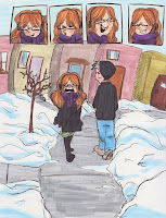
I think a lot of us have been lazy pieces of crap lately, well, I know I have at least. Lets do something different and just draw things we wanna draw. I had some good fun doing it today.
Friday, November 12, 2010
Saturday, October 30, 2010
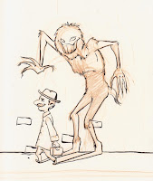
Monster dude

Critique me, I suck at monsters
For a digipainting, the torso's, right arm and part of the left arm is going to be 3D like while the rest will be flat.
Its a shadow monster that latches onto some losers shadow, its an energy drainer and gets bigger and bigger as it lives on the guy, and it eventually can leave its host.
Labels:
char design,
character design,
critique me,
Dani,
Help,
homework,
Rough
Thursday, October 28, 2010
cuz mikki needs help
Mikki you should check out these people especially
http://ashleybambaland.blogspot.com/ Ashely Wood
http://www.skottieyoung.com/ Skottie Young
http://antoniosantamaria.blogspot.com/
http://coyotesaskia.blogspot.com/
http://makismlost.blogspot.com/
http://search.deviantart.com/?q=gallery:cuson/310467§ion=
http://search.deviantart.com/?q=gallery:Mr--Jack/78515§ion=
http://ezdraws.blogspot.com/
http://search.deviantart.com/?q=gallery:Lancer-X/891575§ion=
http://shaneprigmore.blogspot.com/
http://search.deviantart.com/?q=gallery:W4M1/115687§ion=
http://inspectorcleuzo.blogspot.com
http://kekai.blogspot.com/
http://flaptraps.blogspot.com/
http://tinfoilgames.com/
http://www.robotpencil.org/
Monday, October 25, 2010
In the continuing effort to procrastinate
here's my third try at painting like peter levente (i think that's his name)
1.5hrs
things i learned:
1. it's hard
2. it's really hard
3. dodge, burn - any of the layering methods that produce harsh colours are BAD and take ages to even sorta get rid of...
4. dodge, burn - any of the layering methods that produce harsh colours quickly cause the image to appear.
5. it's pretty fun and i want to get better at this
6. frankly any layering method which produces harsh colours
should be avoided if it all possible.
7. Dani would be a hot barbarian... :p
Awake More Notes:
at first the brushing is pretty random. However, in generally you should be thinking about light and dark and very impressionistic shapes in 3d, ie, paint select an area and paint a bright side then add a dark side, the colour choice doesn't matter just one light and one dark.
when watching his videos note how he pauses, flops the image, impressionisticly paints in an object, connects darks and lights together.
Here Him talk:
http://vimeo.com/927695
painting with intention vs the random
http://vimeo.com/13038087
----
Peter Levente's brush pack http://www.megaupload.com/?d=8JG2SGUI
Labels:
blake,
check it out,
critique me,
Dani,
digital paints,
fml,
Help,
quick paint,
Rough,
RPG
Saturday, October 23, 2010
My Inspiration folder and how I find all this crap
Here's a link to all the images i keep on my phone that many of you have seen:
Blake's Inspiration Images
I find most this via www.conceptart.org CGSociety Art Gallery Dominance War on places like conceptart.org I use the artist's handle and then do a google search for their blog or deviant art account. Once I have that I add the subscription to google reader which then allows me to see all crap in on place. (google reader will also suggest other people you can subscribe to)
there's also this place
http://www.gameartisans.org/forums/index.php
and
http://www.zbrushcentral.com/ (main forum) - yes it's 3d but that doesn't mean it couldn't have been 2d
there's also these people that I don't think are on the previous list
These 3 are all NCsoft employed - the makers of Guild Wars and Guild Wars 2
http://kekai.blogspot.com/
http://flaptraps.blogspot.com/
http://tinfoilgames.com/
Friend of Richard Anderson (Flaptrap)
http://ryandemita.blogspot.com/
Friday, October 22, 2010
Coolio Stuff
Here's a process shot of a painting by mr--jack:
Something worth noting is that he's using a hard edged brush - being all painterly and brush strokey pretty much necessitates it. If you don't it'll look muddy and or gooey.
you can see a whole bunch of his process shots here:
mr--jack process shots
*the above image was made and is owned by Luke Mancini (Mr--Jack)
Thursday, October 21, 2010
My digital method
here are some progress shots of my creature painting:
first a very quick sketch in black and eraser (white BG)
the sticky-outy things are silhouetted dead trees found on google

Further white erasing and new leg positions - the goal here is not really define a light source but to cut in forms that are important.

finally adding in the girl and BG which is just a cloud brush. at this point it's almost ready for a more delicate touch on the erasing.

once it's refined a little more (never actually painting in greys only blacks and erasing white i'll grab a few images off of google, eg: http://theorganicartist.files.wordpress.com/2010/09/ancu.jpg http://nstockham.files.wordpress.com/2009/01/photo-water-colour.jpg and chop out bits of them and paste them all over it in places here i kinda like and then try out different layering methods to get a new and cooler colours. from there I'll be clone stamping with spacing off...
first a very quick sketch in black and eraser (white BG)
the sticky-outy things are silhouetted dead trees found on google

Further white erasing and new leg positions - the goal here is not really define a light source but to cut in forms that are important.

finally adding in the girl and BG which is just a cloud brush. at this point it's almost ready for a more delicate touch on the erasing.

once it's refined a little more (never actually painting in greys only blacks and erasing white i'll grab a few images off of google, eg: http://theorganicartist.files.wordpress.com/2010/09/ancu.jpg http://nstockham.files.wordpress.com/2009/01/photo-water-colour.jpg and chop out bits of them and paste them all over it in places here i kinda like and then try out different layering methods to get a new and cooler colours. from there I'll be clone stamping with spacing off...
Labels:
blake,
digital paints,
example,
homework,
quick paint,
sketch
Friday, October 15, 2010
The Crying Child
Hey Team, Travis here;
So I thought I would destroy Blake monopolisation of this place with my assignment of the head and hands.
I was trying initially to go for a photo realistic face. I decided not to go with that because the half photo-realistic and half painterly were working out for me.
Anyways, tell me whatcha think. I'm open to any suggestions here.
9-10 hours
Thursday, October 14, 2010
hand and face
My head 'n' hands; 5hrs photoshop:
Critiques:
Barney - face (and hand) need more structure and expression isn't really working - hair annoys him
Adam - gets to "furry" on the edges use the eraser; arm is a bit wonky along with neck and shoulder - expression could be better.
Critiques:
Barney - face (and hand) need more structure and expression isn't really working - hair annoys him
Adam - gets to "furry" on the edges use the eraser; arm is a bit wonky along with neck and shoulder - expression could be better.
Monday, October 11, 2010
Grog McGee
Here's my concept for my pirate and my soldier
Notes: I need to bring grog's head down - his neck feels skinny which doesn't make sense.
Saturday, October 9, 2010
neatness
I just stumbled on this and thought it was a worth linking here - it's a good example of how to make a gradient background not look retarded:
Monday, October 4, 2010
Grog McGee
Here is some early work with grog mcgee who will be one of the characters i'm doing for character design:
and this would be the ship he sails on called the black albatros (the ship in the image is the HMS Rose):
Labels:
char design,
character design,
critique me,
homework,
Rough,
sketch,
skool
Sunday, September 19, 2010
Character Design roughs
Labels:
blake,
char design,
character design,
critique me,
Help,
homework,
not finished,
Rough,
sketch,
skool
Monday, September 13, 2010
iz a pirate! (and some other stuff)
First Mr. Pirate Man (aka Grog McGee)
And here's some older stuff (newest to oldest) - most of it is unfinished ... because either I'm bored of it or I don't know how to finish it :/

And here's some older stuff (newest to oldest) - most of it is unfinished ... because either I'm bored of it or I don't know how to finish it :/

Labels:
blake,
char design,
critique me,
digital paints,
not finished,
quick paint,
Rough,
sketch
Subscribe to:
Posts (Atom)


