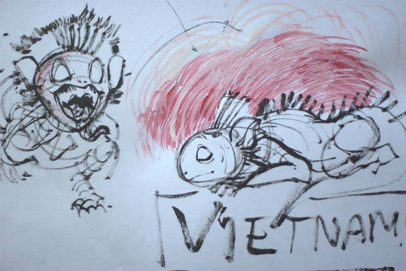
Guys!
I said I'd have this done, but i forgot i would be at the hotel for 3 days at anime north. i was really pumped, but i have no time, so here's my progress! i at least fnished the sketch.
because the first one was so empty with just hiccup, it really hit the feeling i was going for. now that i put in toothless, who i wanted to be scaled properly, he took up ALL the room of the picture. now it looks crowded, it wasnt what i was going for.
so photoshop for the win, when i do colour this, im going to make it a widescreen composition. im going to stretch out the cliff. it's going to be very long so the perspective will hold. it was pretty squished before, now it makes no sense.
ill try to be better! hozaa!
-mikki
p.s. i have now failed TWO challenges...along with everyone else apparently...ahahaha <3
October 16th update
Adam, Blake, Elena, Dani, Mikki, Sean, and Travis are group of students in Animation at Seneca this is our blog of our art work, and on occasion things that are worth noting as reference or whatever.
Cheers and enjoy your visit.
Sunday, May 30, 2010
Wednesday, May 26, 2010
how to train your dragon progress
haiiiii
here's what im working onnnnnnn....hopefully will have this done by Sunday, haven't drawn toothless yet ^___^. hes gonna be with hiccup.
the landscape is unclear now, i know, but here's where i got it from, supposed to be abstract unique cliffs on water. it was on eof the original concept art pieces i found..its the right one:
i was having trouble figuring out his body, there arent many pictures of him. i had downloaded and watched the movie, but it was a crappy version, so he was hard to see. i did some sketches of him to figure him out, and i have screenshots now. here's what i did:
and ill start working on adams soon, now onto finishing my animation hw! yaaaaay
-mikki
Labels:
how to train your dragon,
mikki,
Weekly Challenge
Sunday, May 23, 2010
Saturday, May 22, 2010
second post
Hello, so I have come up with 2 ideas... cause one is time consuming and i don't know how much free time all of you have.
Less time consuming: Design and composition
I'm sure you've all come across really rough drawings that look really good, or drawings that are really quick and simple looking that are really pleasing to the eye. I thought we could do quick drawings and then use your computer program (photoshop/painter/art rage/SAI... etc) to make it look more interesting. The goal of this is to be able to render your sketches pleasingly when making a portfolio.
a few examples;;;
These don't need to be figurative, or correct in perspective and anatomy, but need to have some sort of interesting presentation. Just play with cropping, colours, shapes and composition. Also, subtle details like texture and gradients will make the work more compelling.
Things to try:
play with filter settings
copy and paste stuff
use the lasso tool to make shapes then fill them with paint bucket and go from there
don't put stuff in the centre
looking at photos and zooming in to parts and redrawing those
being quick with them (not spending more than an hour or so)
also, using ms paint can be fun cause you can't undo more than 3 times
Second idea: Surreal Layout
While it's important to make stereotypical layouts, it's also important to do completely surreal ones. Like in the Feel Good Inc video there's the floating island with a windmill-lighthouse on it. The island in the sky thing has been done a lot though... but it effectively gets the idea of this layout project across...
So yeah! how about a river with beds floating down it, or landfill filled with teddy bears and missiles? Or a house made out of muscle tissue with blood everywhere? Whatever's good!
Zub isn't teaching us anymore so make it as rough as you want and don't worry about field size and all that shit :D
omg i still haven't done httyd fan art ;_;
;__________;
Tuesday, May 18, 2010
Researched!
Hiya fwiends ^___^
here is the official blog, for research and such for us. i shall get drawing after i do my homework! iill hopefully see the movie soon, but i'm excited!!
http://howtotrainyourdragon.tumblr.com/
here is the official blog, for research and such for us. i shall get drawing after i do my homework! iill hopefully see the movie soon, but i'm excited!!
http://howtotrainyourdragon.tumblr.com/
Monday, May 17, 2010
Thursday, May 13, 2010
Some Ideas
Hey gang!
Ready to draw how to train your Dragon?
Well here is some videos and blogs to help you get started!
The movie's trailer:
Here are two blogs i found featuring some of the art work from how to train a dragon.
Shane Prigmore
And the Character Design Blog
And this youtube video is chalk full of pre-artwork:
I will be posting some rough sketchs up very shortly. I hope to see your guys stuff up here too!
Good Luck Guys!
~Travis
Subscribe to:
Posts (Atom)